Advertiser Links

Friday, July 13, 2012

Module 7 - Photography and Sculpting

Photography:

Decisive Moment - Henri Cartier Bresson

Henri Cartier Bresson’s interest in photography began as a young boy. He was known to take family photographs with his Box Brownie camera. He was also introduced to oil painting at a young age, by his Uncle Louis who died in World War I. He was 19 at the time of his uncle’s death in 1927. In 1931 Henri Cartier Bresson was inspired by the surrealist photo journalists of the time and used photograph as his medium of choice. This lead to his enlistment in the French Army in WW II as a Corporal in the Film and Photo unit, where he was captured by the Germans in 1940 and sent to a Nazi run work camp. In 1947 rumors of his death hit America and a retrospective was planned to display his footage of war refugees. The retrospective led to the formation of Magnum Photos in 1947, founded by Robert Capa. The mission to “feel the pulse” of people everywhere, at Magnum photos, led to photo journalistic assignments all over the world. After covering Gandhi’s funeral, the Chineese Civil War, and the independence of the Dutch in the East Indies, Henri Cartier Bresson published his book The Decisive Moment in 1952. The cover was done by Henri Matisse. The concept of the book being that photography captures an “instant in life” in its completeness and full glory. Once the moment is passed; it is lost forever. To capture the decisive moment Henri Cartier Bresson was known to paint his camera black, a way of camouflage, so as not to alert the subject. He didn’t want quirkiness associated with unnatural posing for the camera. Later in life in 1968 he put down his camera and returned to painting. He remarked that “photography … was a way into painting, a sort of instant drawing.” The “instant drawing” is the subject that is worthy of an artist’s attention.
The picture below is an example of the decisive moment where a string art sculptor is engrossed in his work and oblivious to the camera. This creates a natural scene that captures an instant in the life of the sculptor.

US Sculptor, Naum GABO
Henri Cartier Bresson
Photograph
Magnum Photos


Instant Collage - Walker Evans

Walker Evans began his career in photography in 1930 when he published three photographs of the Brooklyn Bridge for a Hart Crane poetry book. The year after he took a series of photos for Lincoln Kirstein of the Victorian houses found in Boston, MA. In 1932 he went on assignment in Cuba to take photos for a book by Carelton Beals, where he also met Ernest Hemmingway. He first began working for the American government Resettlement Administration in 1935 and then the Farm Security Administration in 1936 where he was commissioned to photograph the Great Depression’s impoverished. In the same year he did a piece for “Fortune” magazine on Hale County, Alabama, which depicted the residents there as poor and ignorant. His first exhibition was in 1938 at the Museum of Modern Art in New York City. Once in New York, he began to take pictures of the subway from a camera hidden in his coat. Later in his career he wrote for “Time” and was a publisher for “Fortune.”
His eye as a photographer focused on the decisive moment, to create a naturally occurring collage of objects in the subject of his photos. As seen in this photo, he instinctively notices the instant where the most information can be extracted from the scene presented. 

Coal Miner's House
Walker Evans
gelatin silver contact print, 24.2 x 19.1 cm
George Eastman House


Manipulated Photography - Jerry Uelsmann

Jerry Uelsmann became interested in photography at the age of 14. He received two degrees, a B.S. from the Rochester Institute of Technology and Masters of Fine Arts from Indiana University. Afterwards, he began teaching at the University of Florida in 1960. His first solo exhibition was in 1967 at the Museum of Modern Art in New York City. Prior to his exhibition, photographs were viewed as documentary that was unable to be falsified. His unique ability to manipulate photographic images was sheer magic. A number of his photos were used on the classic TV show “The Outer Limits” for the opening credits. Stephen King used his photographs in the book “Salem’s Lot” and the rock band Dream Theater used his work on the cover of their “Train of Thought” album.  The photo here is an example of his ability to manipulate the exposure of the photographs he took. The flower garden and courtyard are superimposed over the clouds and sky in the background. The woman appears to be floating in midair. This all would be very simple to accomplish with Photoshop in today’s digital studio, but this was done before the invention of digital imaging. The shadow of the woman on the ground is quite perplexing and is a marvel to accomplish, considering the analog tools were all the artist had to work with.

Untitled
Jerry Uelsmann
photographs, 34.3 x 26.7 cm
George Eastman House


Sculpture:

Carving - Michelangelo

Michelangelo was a well-rounded artist. He was as comfortable with a brush as he was with a chisel. He had greater ability than any other in the creation of his sculpting. For this sculpting of Bacchus - the Roman God of Wine - his abilities were a detriment. The Cardinal Raffaele Riario commissioned Michelangelo to create a life sized sculpture for his garden. He wanted Michelangelo to depict Bacchus in a drunken state. Michelangelo did this so well, by manipulating the face to a blank stare and off balance posture, that the Cardinal rejected the piece. It was ultimately bought by a banker, Jacopo Galli, for his garden.

BacchusMichelangelo


Drunken Bacchus
Michelangelo
sculpture
Italian and other European Art


Modeling - Robert Arneson

Robert Arneson was an artist who earned his Master’s in Fine Arts in 1958 at California College of the Arts. He then went to work as a cartoonist, as did many of his contemporaries. In the 1960’s he abandoned formal notions of art and helped foster “Funk Art.” This was a style that used everyday items in a confrontational manner. One of his most confrontational pieces was done in 1978; it was the bust of assassinated San Francisco Mayor George Moscone. The caption “Bang Bang Bang Bang” and “Harvey Milk Too!” were posted on the front of the pedestal. A lot of his artwork used heads that resembled self-portraits of the artist himself. Each of the different heads had an almost cartoon like characteristic to them.  An example of one of his sculpting that uses an everyday object, such as an ordinary rotary phone. He creates a controversial aspect by embedding boobs into the piece and adorns it with a funky title - “Call Girl.” This piece is listed here. 

Call Girl
Albert Arneson
ceramic, metal, 46 cm high
University of California, San Diego


Earth Art - Andy Goldsworthy

Andy Goldsworthy is a former mathematics professor from the University of Leeds. He studied art at Bradford College, and Preston Polytechnic where he received a Bachelor of Arts degree. He is also the focus of a documentary by Thomas Riedelsheimer called “Rivers and Tides” for his Earth Artwork. He also received 8 awards from 1979 to 2000 from the British art community. The example here displays the simple use of Yellow Elm leafs to cover a rock in a stream which changes the color of the rock, making it stand out from the surroundings. The rock almost looks like a huge chunk of gold resting in the middle of the stream.

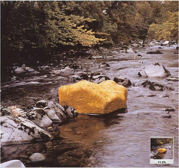
Scaur Water, Yellow Elm leaves laid over a Rock
Andy Goldsworthy
Designed Landscapes
Foundation for Landscape Studies

Looking at Andy Goldsworthy’s Scaur Water earth art is not a very noticeable example of this form and medium. He is involved in a project to recreate and preserve a site in England where the more noticeable Earth Artwork called “Mud Man and Moss Maiden” reside.

Mud Man and Moss Maiden
Lost Gardens of Heligan
Earth Art
webecoist web site


Monday, July 9, 2012

Module 6 - Painting and Printing


Etching - Rembrandt van Rijn

Etching is a print technique where a metal plate is covered in ground, either soft or hard, that protect it from the acid used to produce the printing plate. Then the artist draws something as they would a pen and paper drawing making sure to use the details of line to produce contour, shading and outline. Once the artist’s drawing has marked the plate the artist uses a hard needle like tool to scratch the drawing onto the ground to expose the plate. Once finished the artist uses acid to “etch” the areas no longer covered by the ground. If done properly the result is a print. Like the one pictured below.


Shell (Conus Marmoreus); state II
Rembrant van Rijn
etching, drypoint and burin, 9.7 x 13.2 cm
Erich Lessing Culture and Fine Arts Archives

Rembrandt, a Dutch artist who is sometime called "one of the great prophets of civilization," for his knowledge of the Bible and for his teachings. He was considered one of the greatest teachers among the Dutch artists. His knowledge of various art techniques and dedication to his craft is the basis for his greatness.


Wallpaper Design - Charles Burchfield

An artist local to the Buffalo, NY area and namesake of the Buffalo State College art center is talented in many areas. For one he is talented in print making. A number of his prints are used for wallpaper. An example of this type of work is depicted below.

Morning Glories
Charles Burchfield
print
Burchfield Penny Art Center

Watercolor - Charles Burchfield  

The multi- talented Burchfield has a number of paintings that are displayed at the Burchfield Penny Art Center located on the Buffalo State College campus. His use of watercolor and "dry brush" technique, as in the following painting is an example, exhibits how one can get a realistic looking portrait from the use of simple media.

Black Iron
Charles Burchfield
watercolor, 29 x 41 in.
The Carnegie Arts of the United States Collection


Burchfield was born in Ashtabula, OH and lived there most of his life where his dedication to depicting nature was of utmost importance. He did the work not for art's sake but for the sake of capturing the beauty of nature. Burchfield was dedicated to the use of "dry brush" technique when painting his watercolors. He wanted to depict the classical qualities of painting that was found in works created using oil paints.When he moved to Buffalo, NY in 1924 he got a job at at the H.M. Birge wallpaper company, where a number of his prints became recognized as great artwork. In his later years he had a bout with dementia and his work reflected the stigma. His brush strokes became less deliberate and more sweeping to impart the sense of grandeur and being close to the gods.


Fresco - Diego Rivera

The fresco technique involves the use of pigmented limewater over wet plaster - known as buon fresco - or over dry plaster - known as fresco secco. The buon fresco method lasts longer because the paint is applied while the plaster is still wet allowing the paint to infuse with the plaster. The fresco secco - or “dry” method - doesn’t hold up over time as well because the paint is applied to a dry wall, and the paint doesn’t have the ability to infuse with the plaster. In adverse weather conditions the fresco secco has been known to flake off as in Michelangelo’s Sistine Chapel. The work listed below an example of fresco is done by Diego Riviera.

The History of Cuernavaca and Morelos: The Conquest, detailed Battle of the Aztecs & Spaniards
Rivera Diego
fresco
Palacio de Cortes, Cuernavaca

Rivera Diego, considered the greatest Mexican artist of the twentieth century, claimed that the "...artist isn't capable of loving until he forgets himself and sacrifices himself if necessary ...." This became a basis for Diego's politics and his conviction to art. He began in Europe where he discovered his medium of choice. Fresco, was a way he could display his political concepts through his artwork. He was commissioned by the Stock Exchange and the California School of Fine arts to produce his grand fresco murals for public display. One controversial piece in which he commissioned by the Rockefellers  to paint a fresco in the RCA lobby. The mural was ultimately destroyed because he depicted Lennon leading workers in a protest of the labor party. He returned to Mexico to complete the fresco mural there.


Mixed Medium - Robert Rauschenberg

This painting entitled Female Figure (Blueprint) is one of the few pieces that are not a collage of icons and abstract forms. I think he captures the essence of the idealism of womanhood at that time in America’s history. The light originating from the loins suggests the power of fertility in spiritual form, while the hands raised about the face appear to be a measure of protection from the forces of darkness in the surrounding shadows. The overall context gives off the ambience of deity, or an angelic quality. The piece is done as an architectural drawing would be, on blueprint paper, which is the reason for the Mixed Medium claim.

Female Figure (Blueprint)
Robert Rauschenberg
monoprint on blueprint paper, 8'9" x 3'
University of California, San Diego


The second picture here is a better example of Mixed Medium work. The ordinary objects mixed with the painted material are typical of Mixed Medium. The collage of painted work on the side of the box is a typical style used by Rauschenberg along with the everyday objects, such as the rooster on the top and the pillow which everything is precariously purched upon.


Odalisque
Robert Rauschenberg
freestanding combine-painting, 83" x 25.25" x 25.125"
Museum Ludwig

Robert Rauschenberg is an artist who is very respected by his peers. It is said that he was an inspiration to many of his contemporaries. The Rauschenberg Foundation art gallery has many works that were sent as gifts from artists with which he collaborated over the years. Some of the most well-known artists include Andy Warhol, William De Kooning, Jasper Johns and Roy Lichtenstein, to name a few. Even today he continues to assist striving artists through sales at the Rauschenberg Foundation art gallery. Many of the pieces are one-of-a-kind works that are donated out of admiration and respect for Robert Rauschenberg. It is not easy to say whether Rauschenberg was the inspiration for Andy Warhol’s “Factory” studio or if it was solely Warhol’s doing. Rauschenberg’s loft on Lafayette St in New York City resembled the same type of atmosphere as the “Factory.” Many were invited to enjoy the open party atmosphere, much like the Warhol “Factory.”


 Collage - Jess (Collins)

This piece by Jess Collins is an interesting example of collage. The many different pictures that contribute to the overall form of a person squatting next to a tree can be seen for its distinct parts upon closer inspection. Click on the picture to see a larger version to distinguish the detail.

Mouse's Tale
Jess
Paste-up, 47 x 32 cm.
San Francisco Museum of Modern Art

Jess (Collins), was born in Long Beach, CA and worked on the Manhattan Project after joining the military. With the threat of world obliteration, Jess decided to focus solely on his artwork. Many of his pieces were centered on the concepts of the chemistry, alchemy, and the occult. He did a few pieces that were done in the well know "paint by number" style most amateur artists are familiar with. He was noted as an illustrator of the Dick Tracy comics. 


Friday, June 29, 2012

Module 5 - Principals of Design


For this assignment I was unable to adhere to my original blog design. It was mandatory that the textual descriptions be incorporated into the pictures which they described. Overall, I’m not sure if it is an enhancement or a deterrent to the form and content of my original design. I only know it made this week’s entry more cumbersome. With that said, here are the concepts discussed this past week pertaining to the principals of art design. Specifically addressed here is the apparent balance of the art form; the emphasis on focal point; the repetition of shapes and colors to create rhythm; the use contrast and variety to add visual interest; the concept of visual motion and implied line; and the use of scale and proportion in unusual ways.
 

Balance 

Pomona
by Childe Hassam (1859-1935)
oil on canvas, 94.3 x 64.2 cm
Smithsonian American Art Museum

Emphasis 

Rubens, His Wife Helena Fourment, and Their Son Peter Paul
by Peter Paul Rubens (1577-1640)
oil on wood, 203.8 x 158.1 cm
The Metropolitan Museum of Art

Repetition/Rhythm 

In the North the Negro had better educational facilities
by Jacob Lawrence (1917-2000)
tempera on gesso on composition board
The Museum of Modern Art

Contrast/Variety 

Plaque: Warrior Chief, Warriors and Attendants
Nigera; Edo Court of Benin
Brass
The Metropolitan Museum of Art

Visual Movement (Continuation) 

Descent from the Cross
by Peter Paul Rubens (1577-1640)
painting
Art, Archaeology and Architecture

Scale and Proportion 

Plantoir
by Claes Oldenburg and Coosje Van Bruggen
stainless steel, aluminum, fiber-reinforced plastic, painted with polyurethane enamel
Image and original data provided by Larry Qualls

Another example of scale and proportion:

Nithon Bridge in Edo (Edo nihombashi), from the series Thirty-six Views of Mt. Fuji (Fugaku sanjurokkei)
by Hokusai (1760-1849)
color woodcut
Fine Arts Museum of San Francisco
 
Along the lines of the first example of scale and proportion, by Claes Oldenburg and Coosje Van Bruggen, is this video found on YouTube uses an innovative way in which to get movie goers out to the movies. The video displays an example of how art design can be used in advertising. London giveaway video


Sunday, June 24, 2012

Module 4 - Light, Color and other Formal Elements


For this week’s post, the aspects of light, color and other formal elements such as pattern, actual texture, impasto, and frottage were discussed. Some of the concepts examined, relating to light, are used by artist to constitute 3D objects using the techniques of chiaroscuro as in the first image. This and other approaches to creating 3D portrayals of 2D objects are the topic of discussion here.

Chiaroscuro


Chiaroscuro is the use of gradient shading and chromatic colors to depict 2 dimensional objects as if they are 3 dimensional. The shading generates contour in the surface of the object by using the perception of a light source and the resulting shadows casted by that light.


Here is an example of the 3D effect chiaroscuro produces when used in creating works of art. This woodcutting by Albrecht Durer (1471 - 1528) uses the technique to create a life like rendition of a rhinoceros. Cross-Hatching is also employed by the artist to create contour in the woodcutting.

Rhinoceros
by Albrecht Durer (1471-1528)
woodcut in black line, with blue-green tone block, 8.325” x 11.75”
Boston Museum of Fine Arts

Categories of Light

Artists use light in many ways in their artwork. The properties of light are described as being additive. This means that when the primary colors of light - red, green and blue - are added together or overlapped, they make up the spectrum of light seen by the eye. White light contains all three colors. Contrary to the additive process of light the subtractive properties of reflected light create the pallet of colors seen by mixing red, yellow, and blue. They are the primary colors. The various colors and shades created by the additive and subtractive process are shown below.


An artist who has taken this idea of additive and subtractive light properties literally and used it as the main focus of his work is Dan Flavin. Here he has used fluorescent lights of various colors to dispense his brand of artwork. If you look closely at the following picture of an installation done in the Massachusetts Museum of Contemporary Art, you will notice both the additive and subtractive qualities of light and color. From left to right the lights are made up of white, red, yellow, blue, and green fluorescent tubes in the vertical position with white light in the horizontal positions. The overall look of the light emitted is seen as white light, except where very close to the colored tubes. This is an example of the additive properties of light. The same light bouncing off the light colored walls also appears very close to white. The interesting part is where the light is reflected off the dark floor and the subtractive qualities of light are observed, where the colors of the tubes are evident, when the light reflects off the dark surface.

Untitled (to Don Judd, colorist)
by Dan Flavin
Installation in the Massachusetts Museum of Contemporary Art
from University of California, San Diego

Arbitrary Color

The idea that trees are brown and green like grass, water is composed of shades of blue along with the sky, and people range from brown to pale shades of tan, are all notions of realistic portrayals of objects we see every day.  What Matisse did in his Sketch for “The Joy of Life” was to use Arbitrary Color when painting the objects in this piece.  As you can plainly see the sky is pinkish-purple the grass is yellow, the trees are orange, some pinkish-purple, and the people are all pink with brown outlines. All of which are arbitrary to what the natural colors of the objects in the painting.

Esquisse pour “Le Bonheur de vivre” (Sketch for “The Joy of Life”)
by Henri Matisse (1869-1954)
oil on canvas, 16” x 21.5”
San Francisco Museum of Modern Art

Analogous Color Scheme

As seen in the color wheel on the left, there are many variations of color and even more tints and shadings of those variations. Each of the colors on the wheel can be made up of the three primary colors; red, yellow, and blue; mixed with white to tint the color or mixed with black to shade the color. The orientation of the colors around the wheel has significance as well. Colors across from one another are complimentary, while colors next to each other are part of the analogous color scheme.


Here is an example of the use of an analogous color scheme in the painting by Pierre Bonnard. Notice the overall tone of the hues in the painting that surround the analogous red color scheme. As one can readily see from the color wheel the colors used are within two steps to the left and right of red, with accents of the complimentary color from across the wheel, green. 

Bowl of Cherries
by Pierre Bonnard
oil on canvas, 11.875” x 16.5”in
The Phillips Collection, Gift of Marion L. Ring Estate

Frottage in Art

The term frottage is defined as the use of a technique where one puts a sheet of paper over a textured object and, using the side of the pencil, rubs the sheet of paper to impose the texture onto the paper. This drawing by Max Ernst (1891-1976) is an example of this technique. One can notice the chain-link fence diamond pattern along the bottom. While the form is that of a fish like object, the textured look of the scales is created by, the means of frottage having been incorporated into the drawing. It looks like a number of different surfaces were rubbed to produce the desired textured effects where necessary.

Escaped
by Max Ernst (1891-1976)
Drawing
University of California, San Diego

Impasto

Many works of art are comprised of varied Actual Textures, and impasto is one of the textural effects artists use to enhance their art. The oil painting by Claude Monet depicted here is an example of impasto. The layering of paint is so pronounced in this piece that it can even be seen in this picture of the original work. The impasto is a way of playing with light by creating shadows where the paint is heaped on the canvas. Most noticeable in the yellow and tan areas of this painting, the shadows are prominent and present a sense of depth. The areas where the shadows cannot easily be noticed, such as the aqua-blue areas in the center portions along the left and right do not have the same depth and are seen as being flat compared to the yellow area.

The Artist’s House in Giverny seen from the Rose Garden
by Claude Monet
oil on canvas, 80 x 90 cm
Erich Lessing Culture and Fine Arts Archives


Monday, June 18, 2012

Module 3 – Art Elements, Line and Space


This article pertains to a few of the formal elements in art, specifically line and shape. The line is one of the most basic of elements. But, it is more than just a simple stroke of the stylus. The line has many functions in art. It can be used to define a shape, as when used to outline an object or to describe its contour. The line is frequently used in ways that may not be part of the form of the artwork, such as when it is used to depict an implied line of action or direction of vision. Lastly, the line has an expressive quality as well. The expressiveness of an artist’s line can sometimes be seen as a signature of the artist. Next we see a few examples of art that depict the various roles of the line.

Outline

This drawing by Henri Gaudier-Brzeska (1891-1915) is an example of the use of line to outline the two figures here, which are representations of the female form. The outline is of an abstract nature, but it is definitive enough to distinguish the subject matter. 

Two Figures
by Henri Gaudier-Brzeska (1891-1915)
Black wash drawings and watercolors, 8.375” x 5.5”
Boston Museum of Fine Arts

Implied Line

Although, implied line is not a visible line created by an actual brush stroke, it is a line of action or a line of sight contained in the work of art. Take a look at the Madonna of the Rocks and notice the numerous pointing gestures implying a line of vision for the eyes to follow. Also, one can notice the implied line of action the child on the left creates, by suggesting that the child is about to dive into the pool of water in the foreground.

Madonna of the Rocks
by Leonardo da Vinci
oil on canvas, 199cm x 122cm
Eric Lessing Culture and Fine Arts Archives

Expressive Line

The lines in this piece by Steve DiBenedetto are an example of the expressiveness an artist can display in the wielding of their brush. In this piece the author chose to use a lot of paint drops in varied sizes in a row to create the semblance of a line.

1947
by Steve DiBenedetto
oil on canvas, 16” x 20”
Image and data provided by Larry Qualls


The remaining examples are used to portray the elements that pertain to describing shape of the subject matter. The use of positive and negative space, visual overlapping, foreshortening and perspective all play a part in the manner in which an artist chooses to display the form. Without taking these elements into consideration certain works of art would not be taken as serious, great works, because of their lack of these elements. Here are a few examples pertaining to the shape of art.

Perspective

In 1435 during The Renaissance, Leon Battista Alberti (1404-1472), provided the first theory of what we now call linear perspective. This painting attributed to Albrecht Durer, done in 1495, is one of the first examples of the use of one point linear perspective.

Courtyard of the Former Castle in Innsbruck, Austria
attributed to Albrecht Durer
watercolor on paper, 335mm x 267mm
Eric Lessing Culture and Fine Arts Archives

Foreshortening

This example of foreshortening, by John William Waterhouse (1849-1917), shows how the object closest to the viewer is slightly smaller than it should be when strict one point perspective is employed. If foreshortening was not used, the object in the foreground would be much larger and could deteriorate the overall form of the artwork, even to the extent of making it look ‘clown like’ or out of proportion Foreshortening is a technique used in perspective to equalize the proportions between the foreground and background.

St. Eulalia
by John William Waterhouse (1849-1917)
Oil on Canvas, 74.25” x 46.25”
University of California, San Diego

Positive/Negative Space

In this picture of Donald K Sultan’s work of art, one can see how the contrast between foreground and background creates a positive to negative relationship. In this piece, entitled Double Dominos, the positive and negative spaces can be almost interchangeable. One question that could be asked, “is it a portrayal of black objects on a white background or white objects on a black background?” The only indication that the latter of the two statements is more plausible, is it the fact that there is a border around the white dice. This creates a sense of the black surface being the background or negative space.

Double Dominos
by Donald k Sultan, Jan 29 1995
latex, tar and spackle on tile over Masonite, 96” x96”
Image provided by Larry Qualls


Resources
Alberti, Leon Battista. On Painting. [First appeared 1435-36] Translated with Introduction and Notes by John R. Spencer. New Haven: Yale University Press. 1970 [First printed 1956].
Online at http://www.noteaccess.com/Texts/Alberti/